There’s one painting that everybody comments on. Maybe it’s huge. Maybe it’s colourful. Maybe you bought it because it “spoke to you,” which is the sophisticated adult version of saying, “I liked it and panicked when someone else walked toward it.”
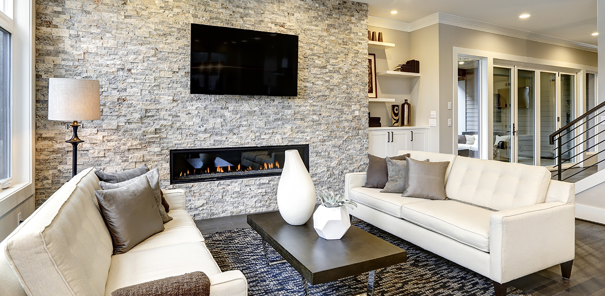
Then there’s the fireplace.
Also large. Also permanent. Also very much interested in being looked at.
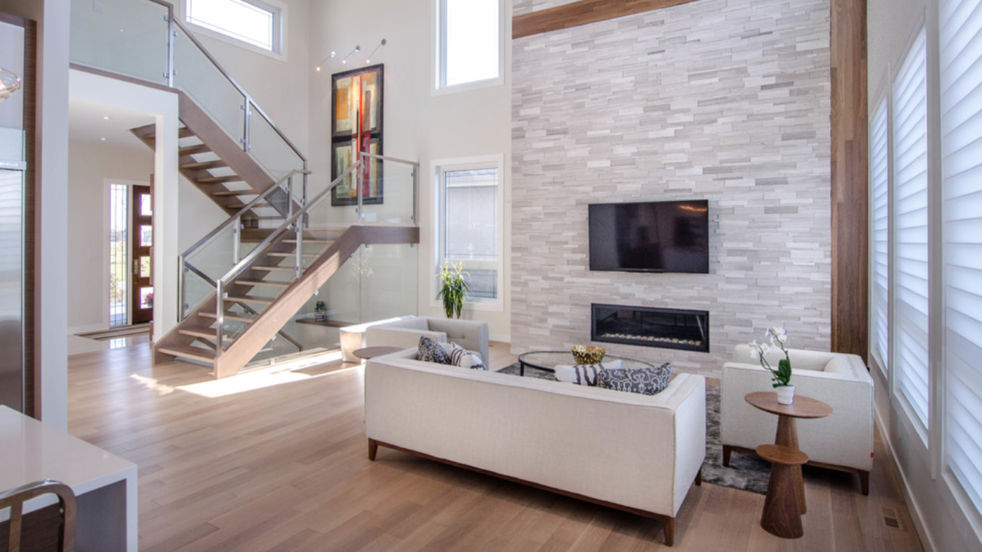
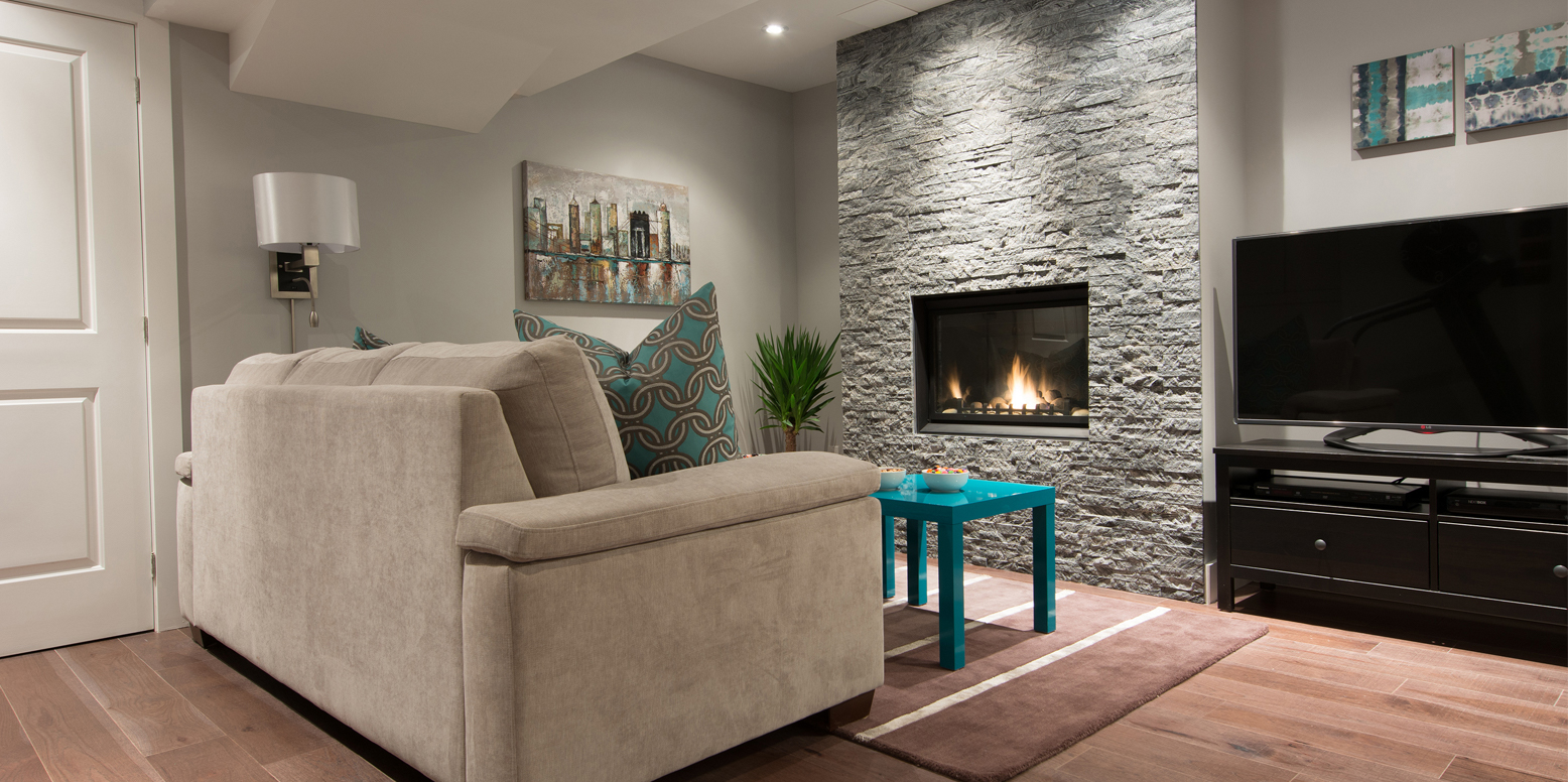
Put strong artwork and strong stone together and the room can be fantastic. Sometimes, it can also feel like two lead singers fighting over the same microphone. That’s why a little planning helps.
“What will my guests notice first?” Answer this question before buying the stone.
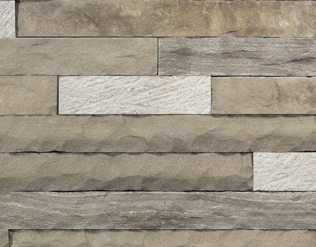
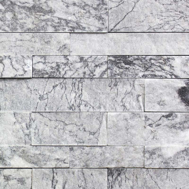
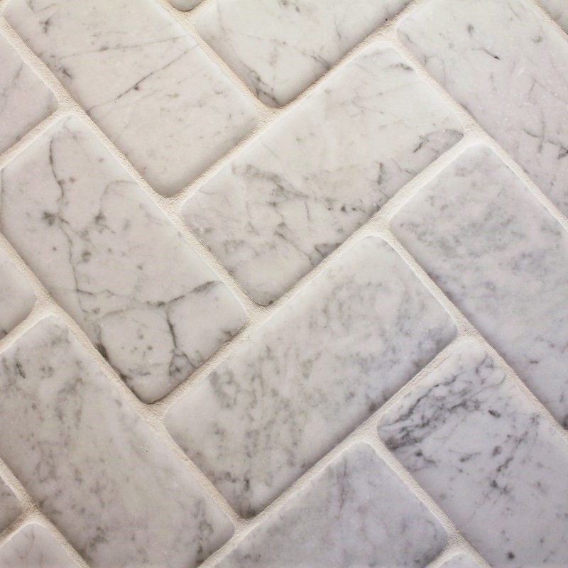
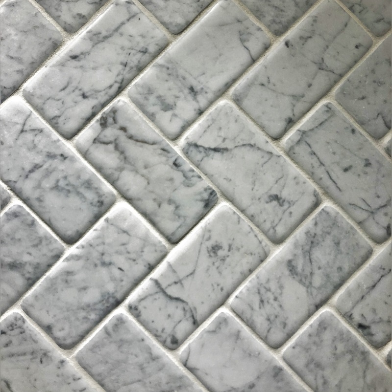
A calmer backdrop goes well with the artwork having bold colours and heavy detailing. Go for softer greys, creams, warm beige, or a finer stone profile.
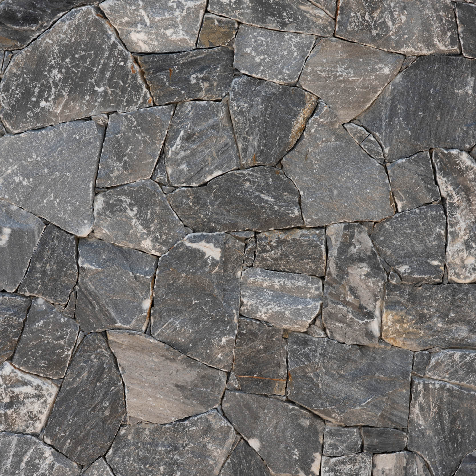
With simple black-and-white photography or minimalist art, you can opt for a stronger wall.
When you’re looking at fireplace stone in Toronto, Canada, step away from the sample. Five feet away is better than five inches away. That’s closer to how you’ll actually see it while in your room.
Artwork can contain eight colours and somehow convince you they all need to appear somewhere else in the room.
They don’t.
Look for a quieter shade hiding in the piece. Maybe there’s a soft cream in the background. A little charcoal in one corner. Some warm taupe sitting there doing all the emotional labour.
Use that as your clue.
When looking for the best fireplace stone veneer in Toronto, Canada, hold the sample near the artwork. A shared undertone can connect the two without making the whole room feel colour-coded like a corporate retreat.
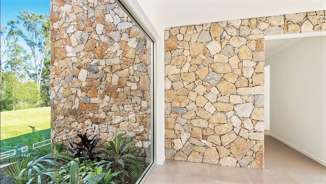
Colour gets blamed for most design drama, but texture can be just as loud.
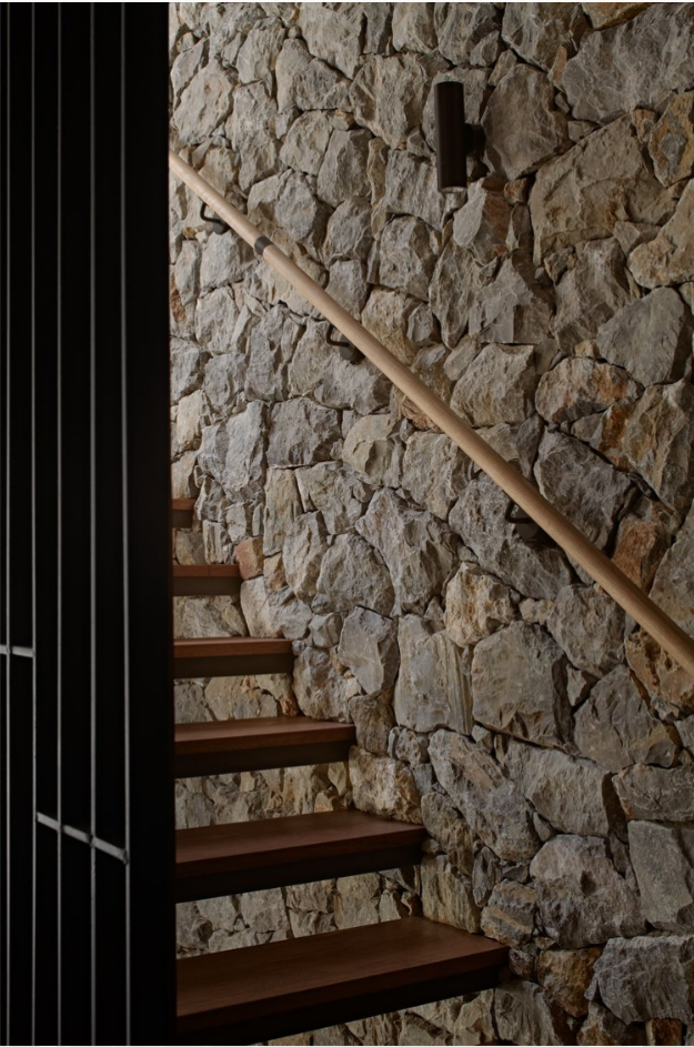
A heavily textured stone creates shadows. A detailed painting creates visual movement. Put both on full volume and the wall can feel busy very quickly.
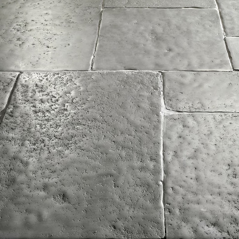
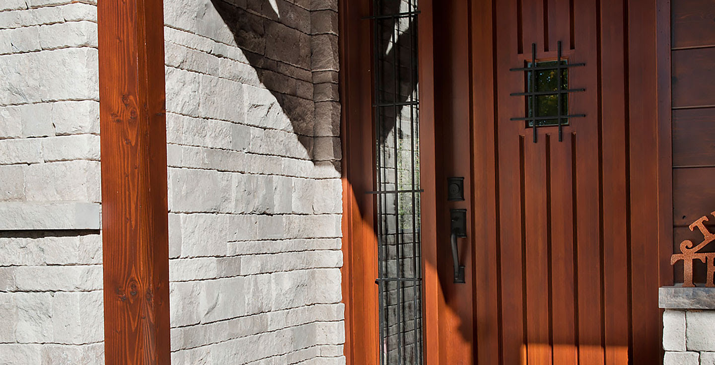
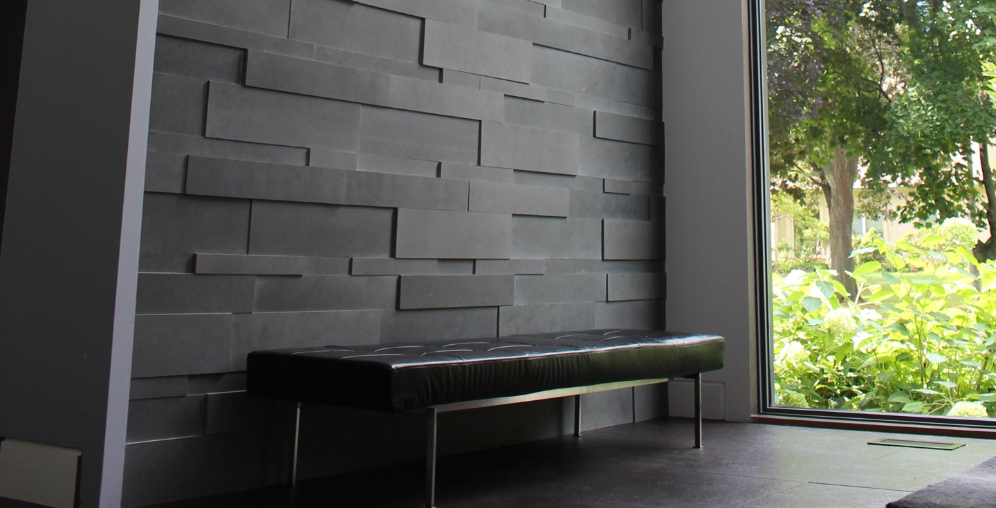
If the art has lots going on, try a flatter stone profile. If the artwork is simple, rougher stone gets more room to show off.
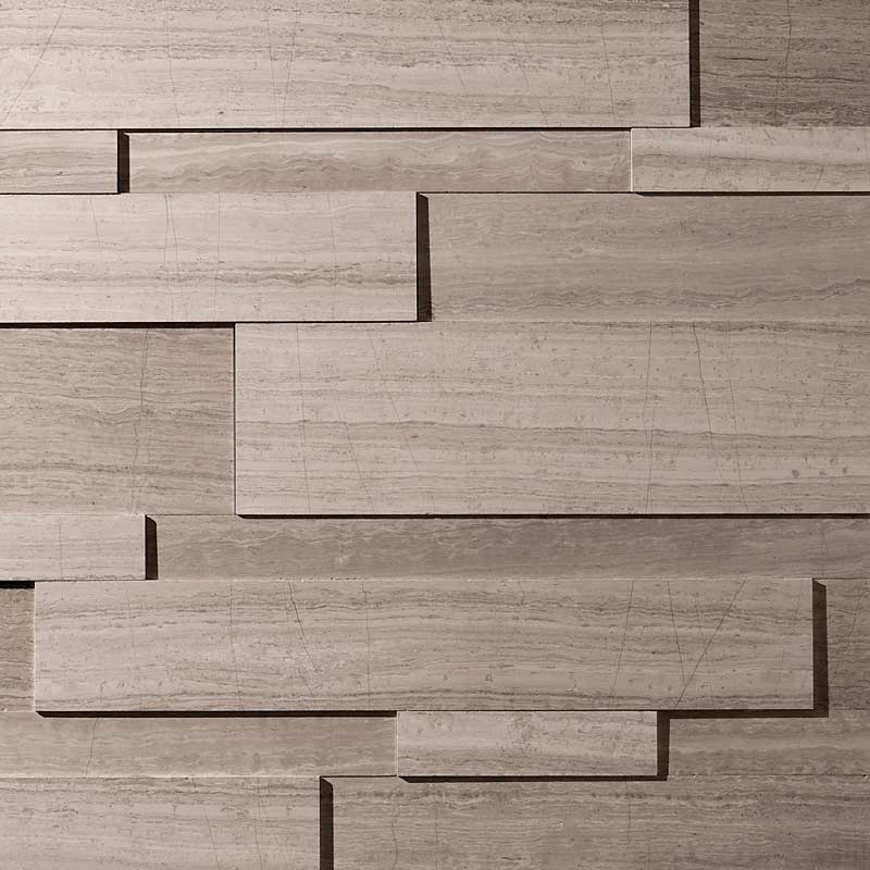
A Toronto fireplace stone veneer with deeper relief can look especially good beside one large, restrained piece of art. The stone handles the texture. The artwork handles the image. Everyone stays in their lane.
Beautiful.
Artwork doesn’t automatically belong above the fireplace.
Sometimes the best move is placing the painting on the neighbouring wall. The fireplace anchors the seating area. The artwork gets its own moment nearby.
That setup can work particularly well in open-plan rooms.
If you’re searching for the best fireplace stone veneer in mississauga, check the room from several angles before choosing. Look from the sofa. Then the dining table. Then the kitchen.
Rooms are sneaky like that. Two things that seem miles apart on the floor plan can spend every evening staring directly at each other.
The picture frame can quietly connect the two features.
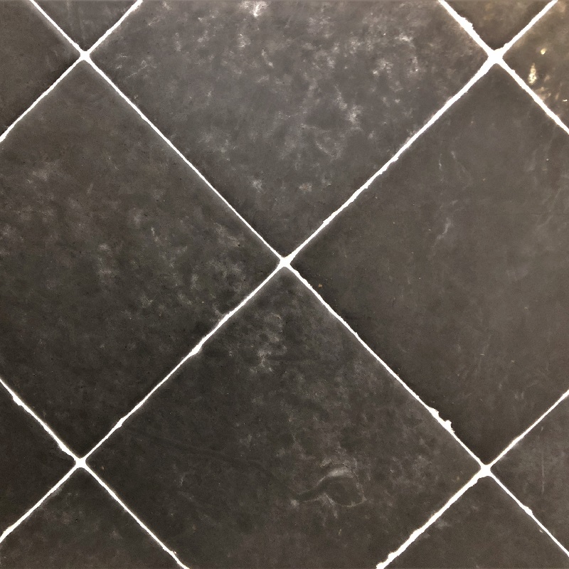
A black frame can pick up charcoal in the stone. Walnut can work with warmer limestone tones. A pale timber frame can soften a cooler fireplace.
Tiny detail. Very useful.
It’s basically the supporting actor who shows up for six minutes and somehow improves the whole movie.
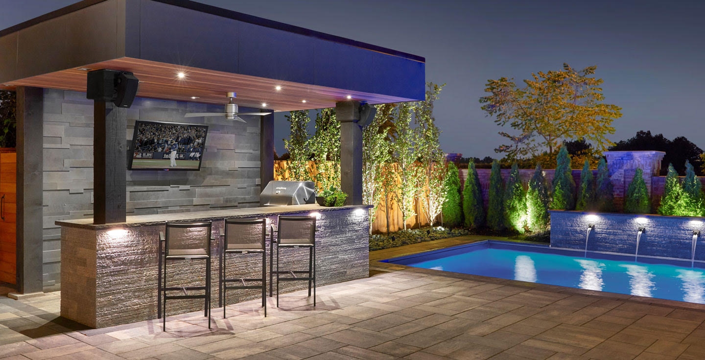
Picture lights make art stand out. Grazing lights make stone texture stand out.
Use both aggressively and congratulations, your living room is opening on Broadway.
Choose where you want the stronger evening effect.
You might spotlight the artwork and let the fireplace sit under softer light. Or let sconces skim across the stone while the artwork stays gently lit.
Check everything at night before committing. Daytime stone and evening stone can have completely different personalities.
For the best fireplace stones, you can explore Erth Coverings. They have premium designs with long warranties. Explore now: https://erthcoverings.com/.