Every year, Benjamin Moore curates a colour wheel filled with carefully selected colour palettes that balance modern-day relevance with long-lasting appeal. Experts look at various design influences like lighting, fabric, furniture, and home accessories to find the symbiotic relationship between colour and paint.
Artists offer a fresh perspective on looking at colour to help influence unique colour pairings. Fashion and culture are constantly evolving and consistently informing experts on colour choices for the year. Fashion specifically is an expression of personality and gives a snapshot of style caught in the moment. What would the ’70s be without harvest gold, barn red or burnt orange? And of course, another determining factor of the years colour is the environment. Absorbing architectural traditions and the natural landscape to produce a distinct colour palette that informs expert’s choices.
As with most design trends, experts also draw inspiration from local and global themes. The past year was interesting, to say the least. As the worldwide coronavirus pandemic brought millions of us back into our homes full-time and many of us transitioned to work-from-home policies. As a result, Benjamin Moore’s 2021 colour palette invited homeowners to use the colour trends palette to bring colour into the home in new and comforting ways.
The profoundly soothing blue-green Aegean Teal, laid-back nudes and bold Mediterranean hues called for us to reflect and reset. As the year winds down and you begin working on your last few home projects, we’ve put together a list of Erth’s stone veneer’s paired with Benjamin Moores 2021 colour of the year palette. We hope you use our pairings as a point of inspiration. Get inspired below.
1) 
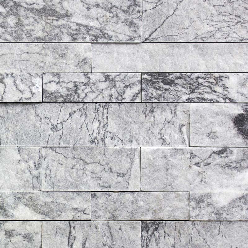
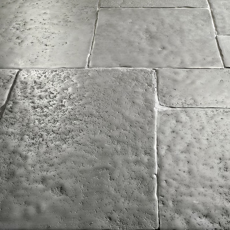
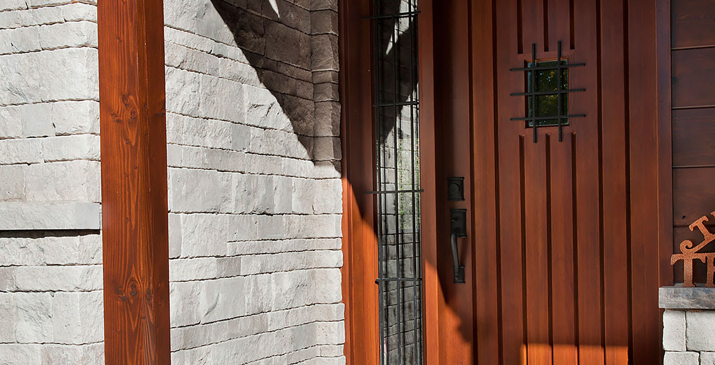
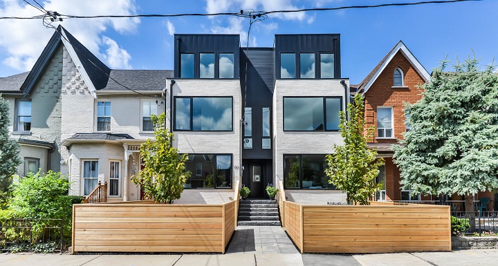
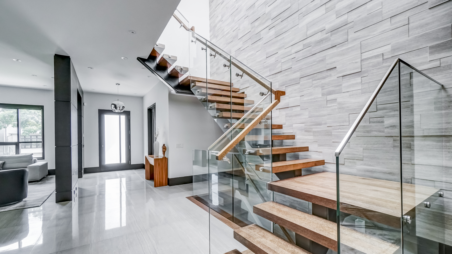
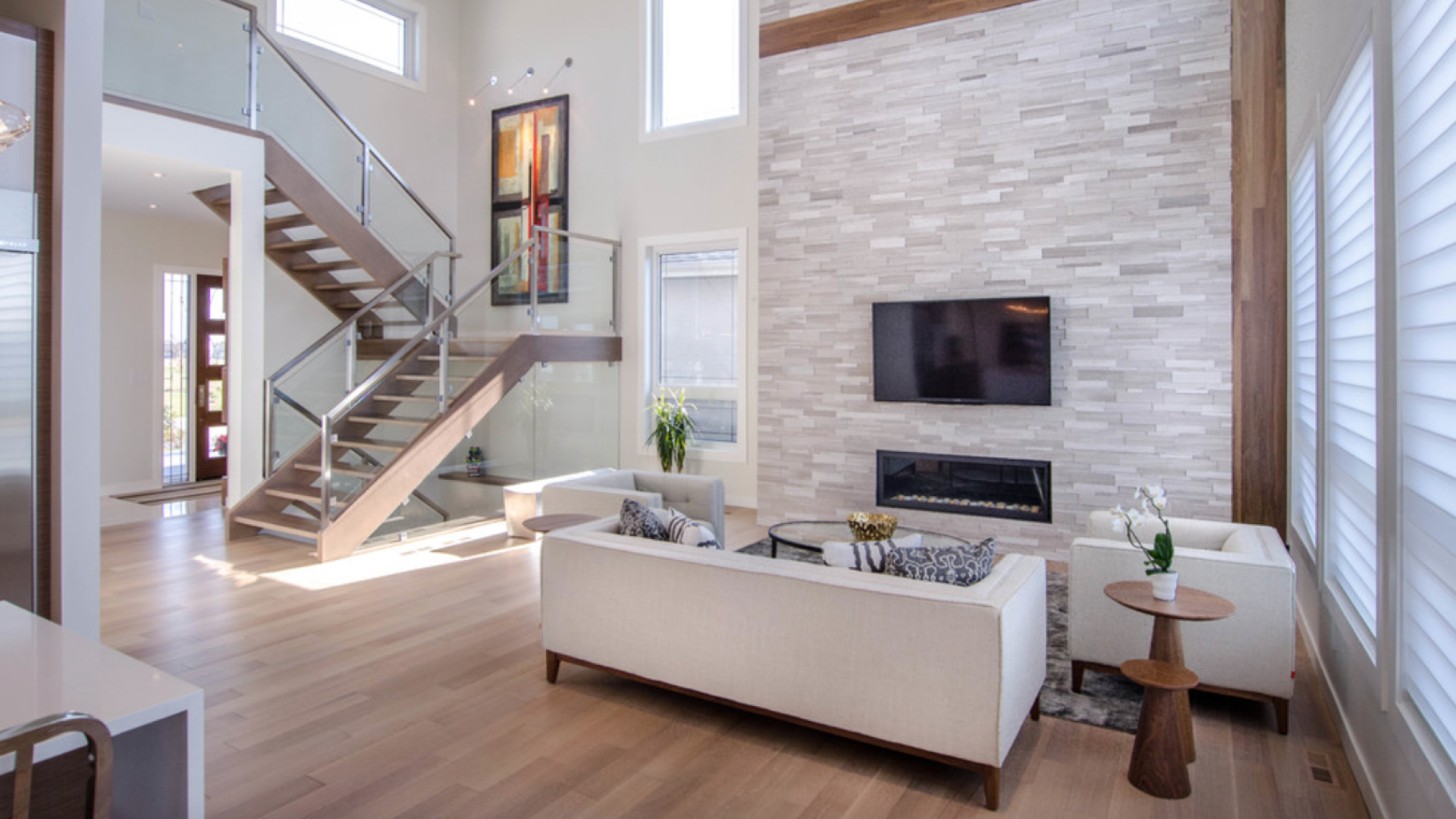
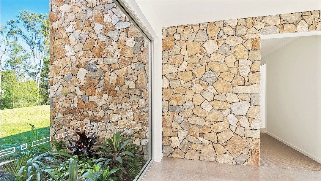
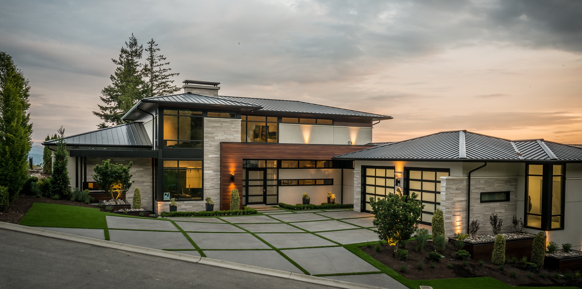
Meet muslin. The effortlessly sophisticated and easily adaptable, soft off-white offers subtle nuances of whites that suit tranquil, serene environments that are versatile and suitably accommodate colour. Pair with Dover from the Cascade collection to create a dynamic entrance or with Pebble from the Durango collection for a colour-enhancing fireplace.
2)

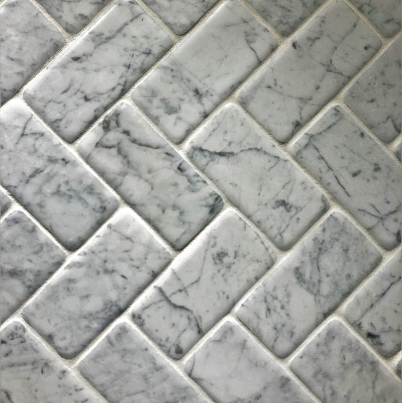
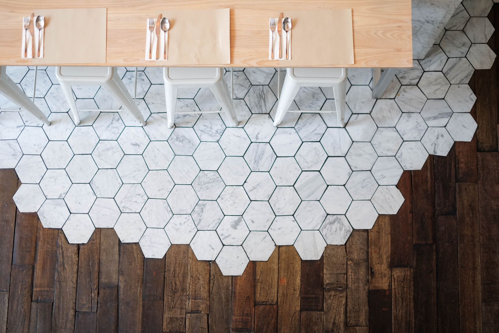
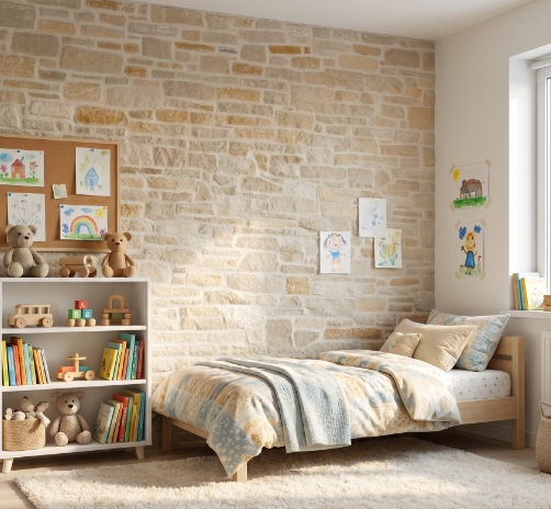
Presenting Foggy Morning, a light and delicate nude with a hint of pink that experts say represent an early morning walk through woods shrouded in a blanket of dew. Pair it with the pebble ivory blend or the dusty, vintage brown pebble bone for the bathroom. It’s the perfect backdrop to an ensuite retreat.
3)
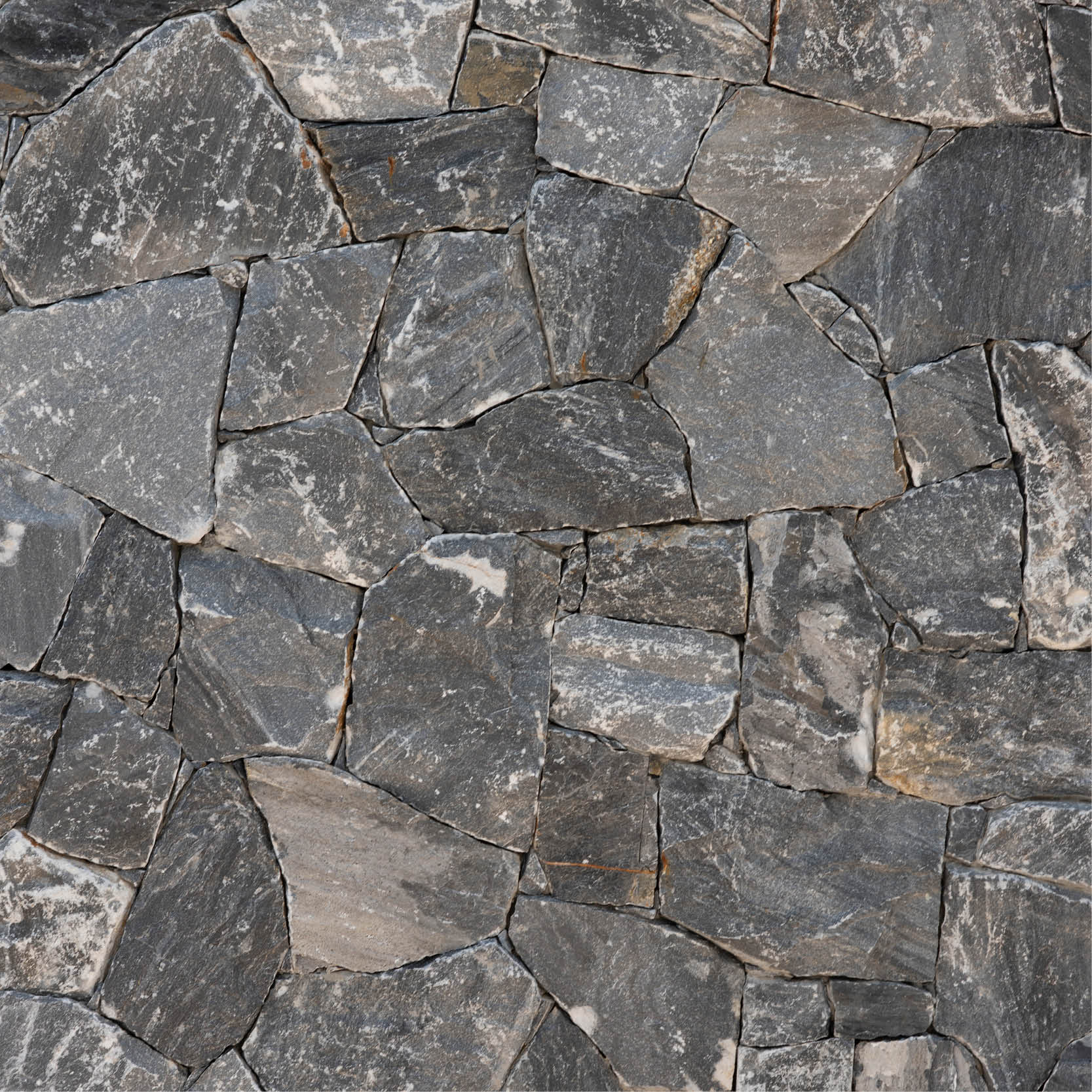
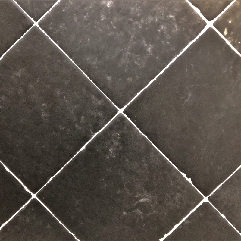
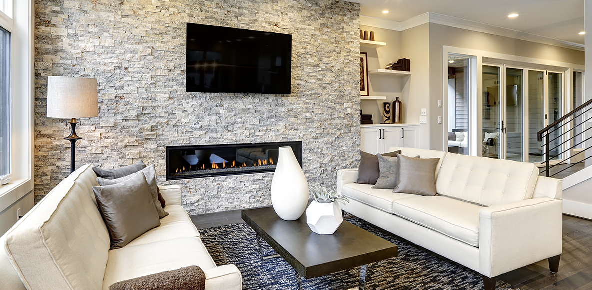
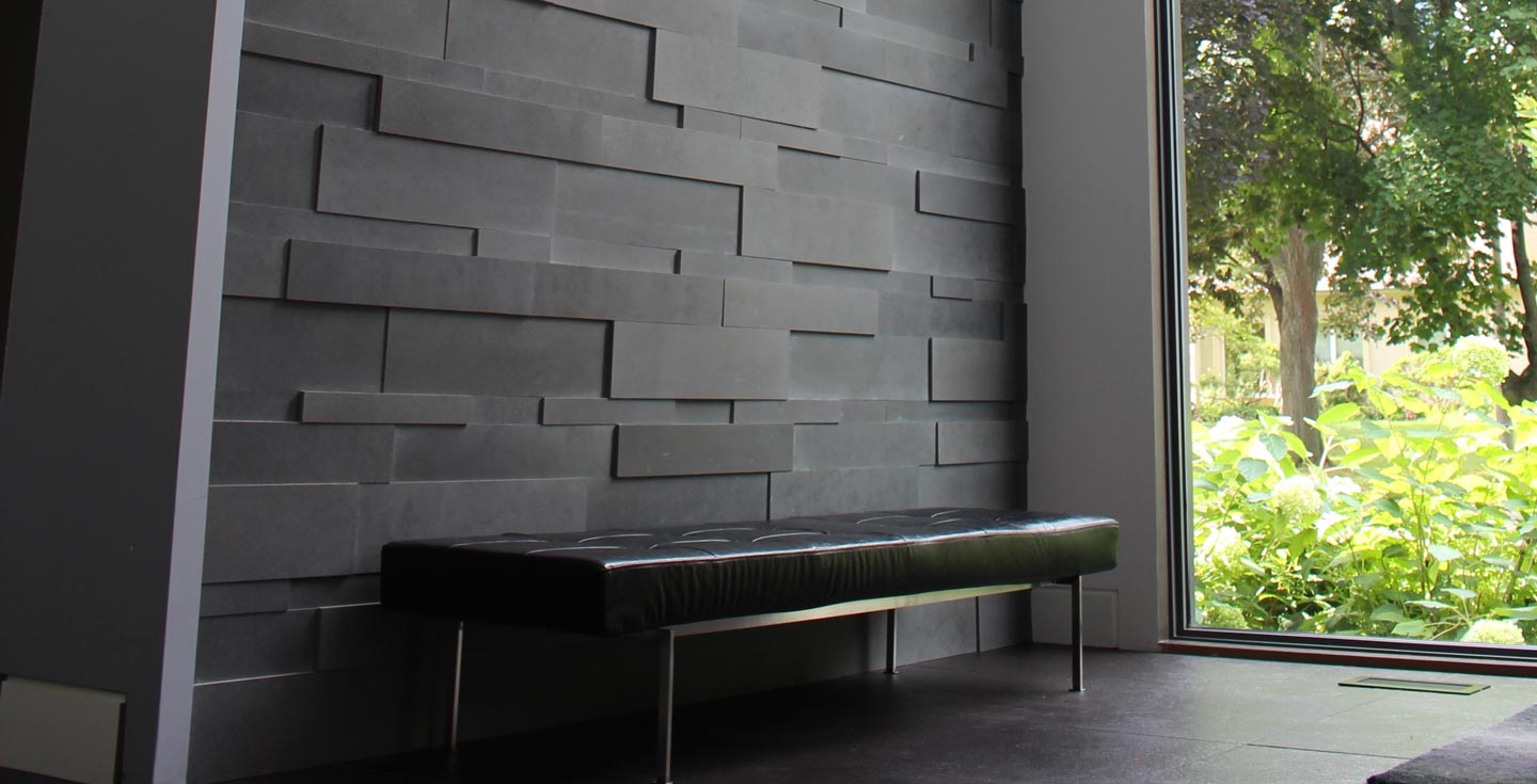
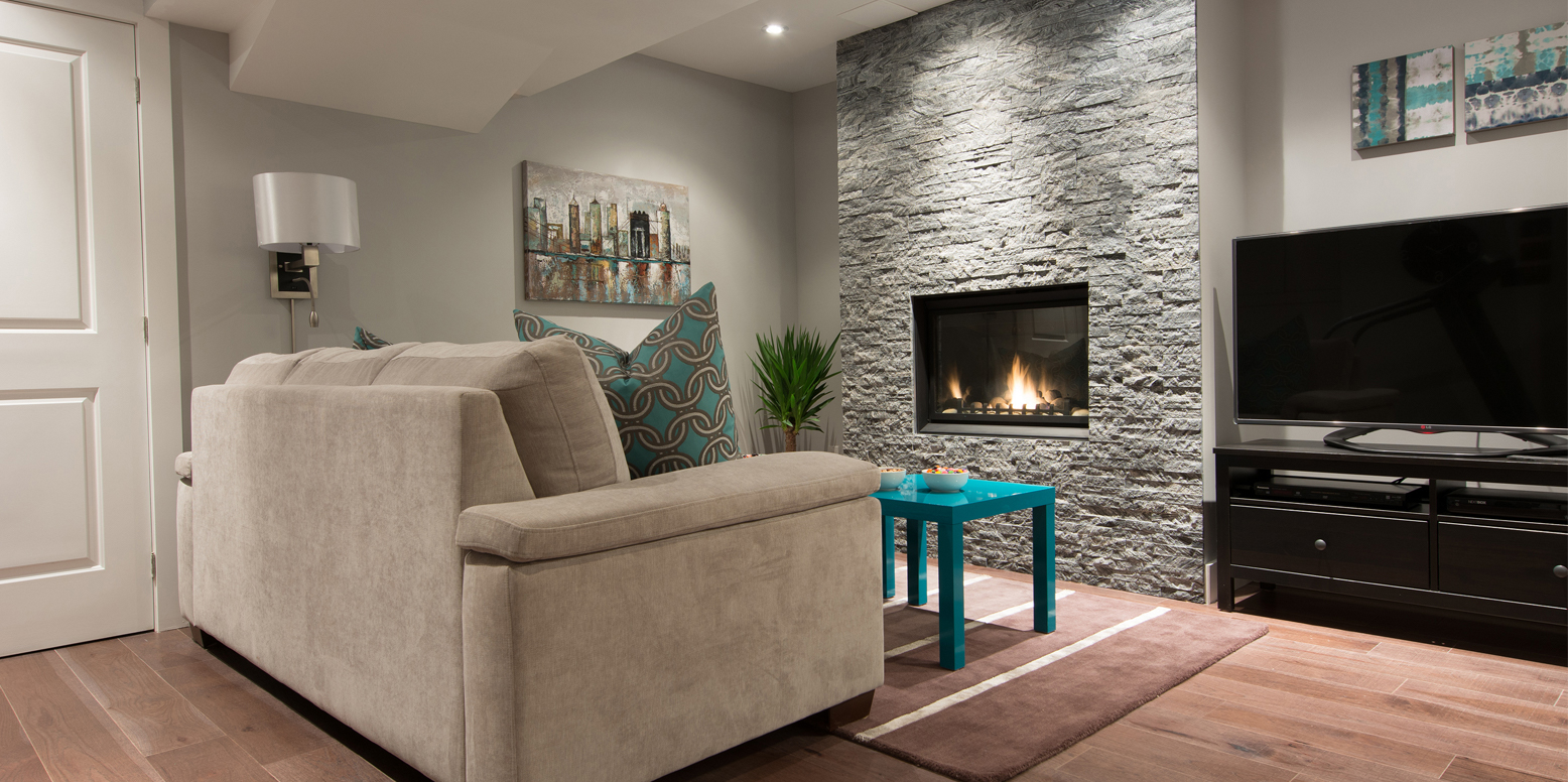
 A statement wall is beckoning with Silhouette. The subtle red undertones make Silhouette a sultry gray that can turn a dull and unremarkable space into a lush, edgy environment. Pair it with panels Bluestone 3d or strips Lavastone to create a living room accent wall that experiments with textures, shapes, and colour in the most exciting way.
4) 
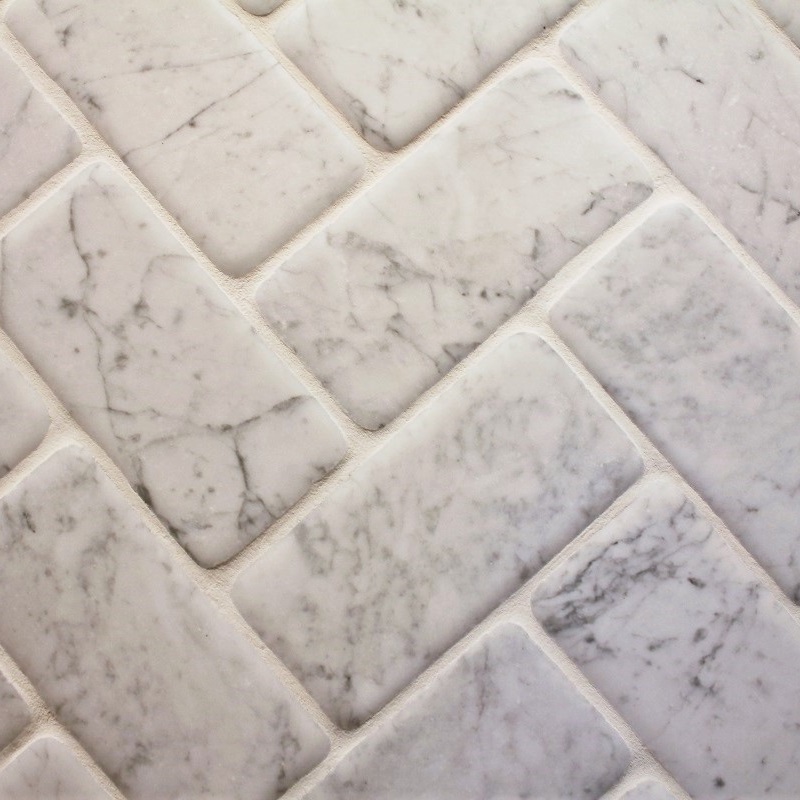
Let there be white. Atrium White is from Benjamin Moore’s off-white collection that features more than 150 variations on white with subtle nuances. Breath new life into your favourite interior space with this white that is subtle enough for it to be low risk but brilliant enough for it to be a high reward. Pair it in the heart of the home, the kitchen, with Lacuno Art from the drift collection or Coral White strips as a kitchen backsplash.
5)
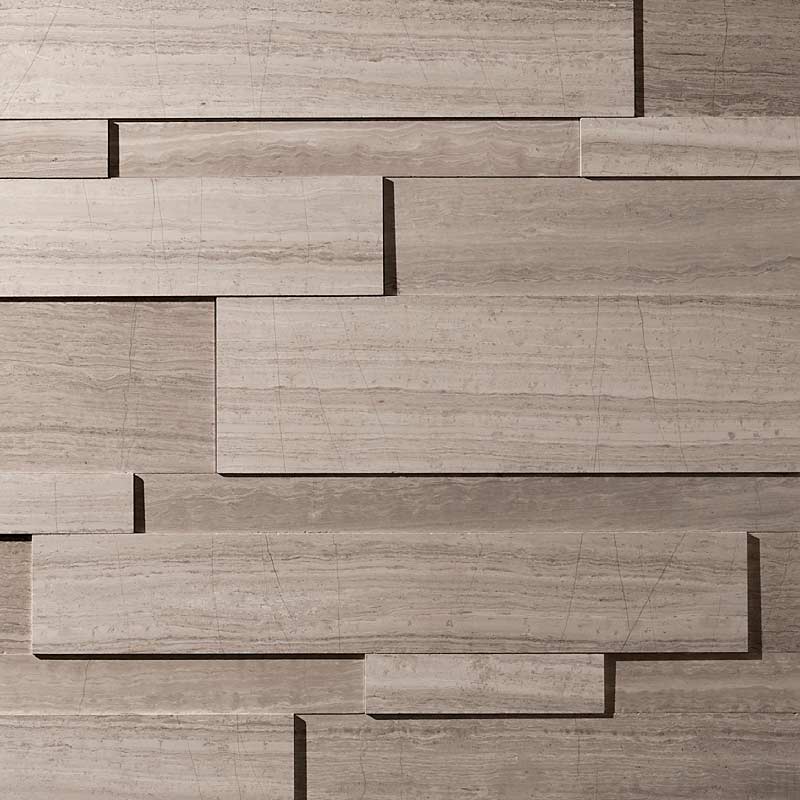
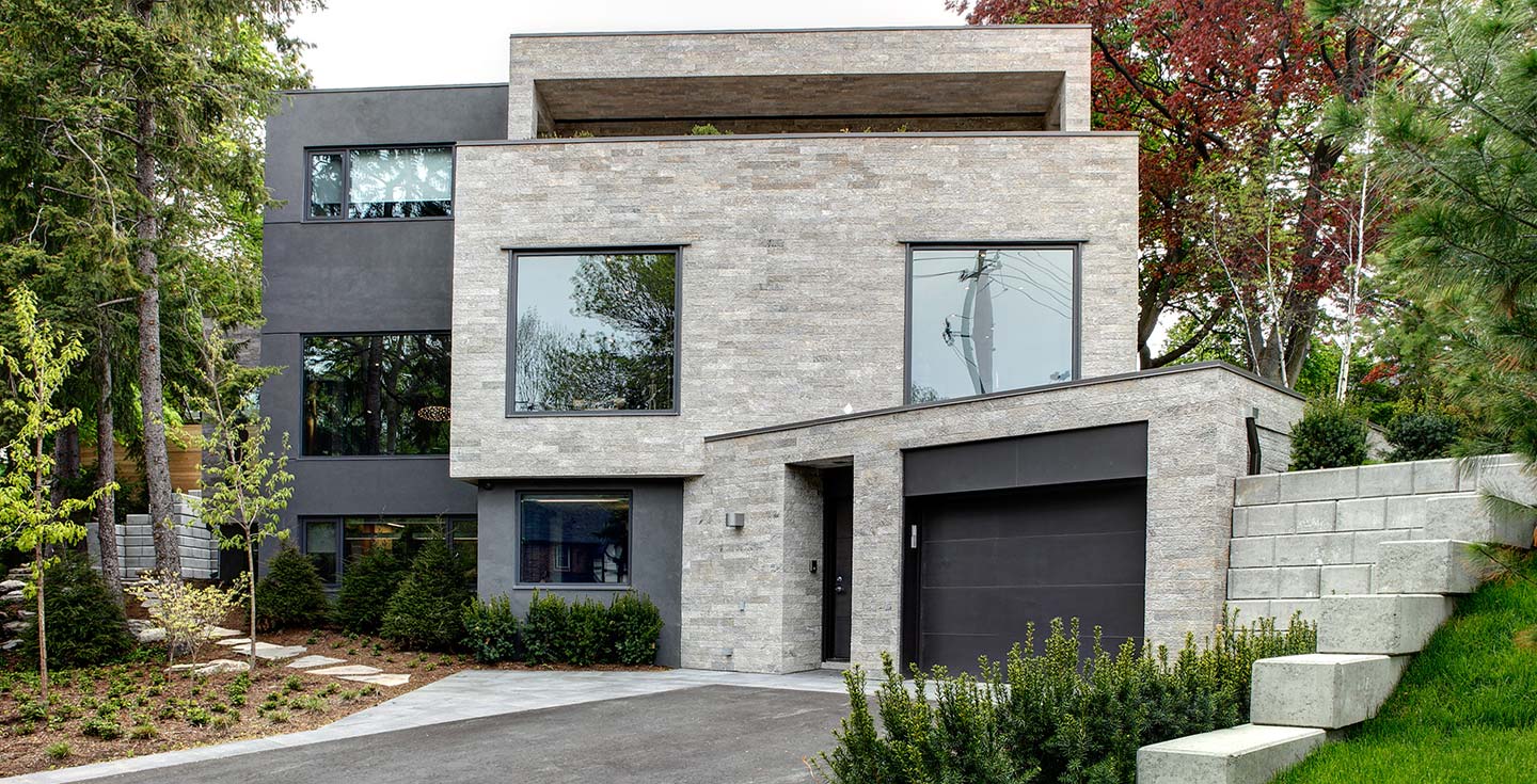
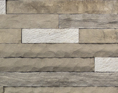
 And finally, Kingsport Gray is part of the Historic Colour collection. A collection of 191 time-honoured hues comprised of Benjamine Moore’s most popular palettes. More brown than gray, enjoy the warm, cozy feeling this shade brings to your walls. It pairs seamlessly with a range of colours like the deeper oranges/grays in the drystack ledgestone or the grayer hues in the Rock Face tundra.
To find the suitable materials and colours that meet your preferences and suit your needs, look no further than Erth coverings veneers. Browse our entire collection of natural stone veneers.






.jpg)
.jpg)